ShopDreamUp AI ArtDreamUp
Deviation Actions
Suggested Deviants
Suggested Collections
You Might Like…
Featured in Groups
Description
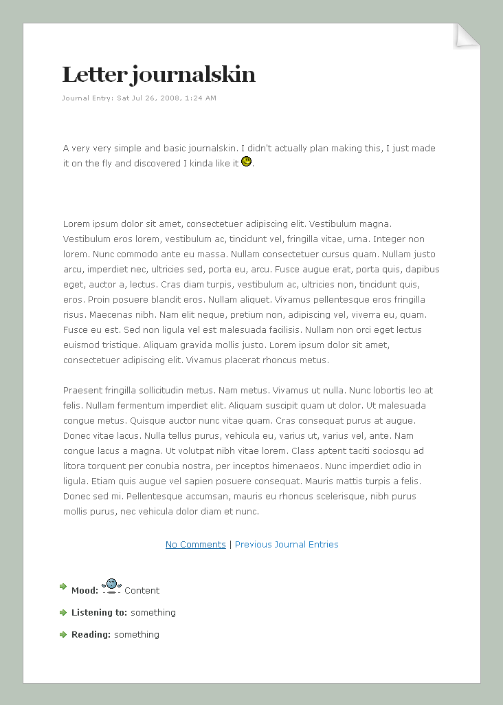
Simple Letter Journalskin v2
__________________________
Very clean and basic journalskin.
Easiest one ever as well.
And that's it. You don't need any html.
It supports lists, blockquote, links and moods.
Live preview can be found here.
FAQ #62: How do I use Journal skins?
Some rights reserved. This work is licensed under a
Creative Commons Attribution-Noncommercial 3.0 License.
In other words: You can use/abuse/modify this skin as you wish. As long as you don't use it for commercial purposes. Giving credit is optional: you can but you don't have to
© 2009 - 2024 janvanlysebettens
Comments97
Join the community to add your comment. Already a deviant? Log In
I am not an expert critic, but this is the skin I've chosen for my journal for the time being - after looking at many others. I did not score it too high on originality, because the "clean and simple concept" in itself is not original, nor making a blog looking as a book page <img src="e.deviantart.net/emoticons/s/s…" width="15" height="15" alt="
The strong points of this design:
1) The fact that the creator designed this skin for the entire home page. It looks like it belongs there and could have easily been a part of original home page design. Many skins just look like someone had dropped a dead cat in the place of a blog, way too different in style from the page itself.
2) Easiest on the eyes both literally and figuratively speaking. This point can't be stressed enough, and I don't even use glasses. Some very beautiful skins are terribly unreadable unless you squint your eyes and turn your head sideways. I was terribly tempted to get a couple of very pretty ones, but the sole reason of poor readability stopped me.
3) Attractive, well proportioned, not cluttered. Can't stand cluttered pages. Your design is a relief for the tired soul <img src="e.deviantart.net/emoticons/s/s…" width="15" height="15" alt="
The only sorta negative-ish thing I can say that it needs a little "umph". Just a tiny little something, like a small ink blot which would in reality be a link to a super-sekrit location. Something that goes against "clean and simple" concept. That is why Impact is not five stars.


![[Custom box code] Wide content](https://images-wixmp-ed30a86b8c4ca887773594c2.wixmp.com/f/f9d3f707-badf-4eba-a9f9-7e67baae16d6/d8jz7o9-7c0976bc-b48f-4ff0-beaf-c7328255f119.png/v1/crop/w_184)


